BRANDS
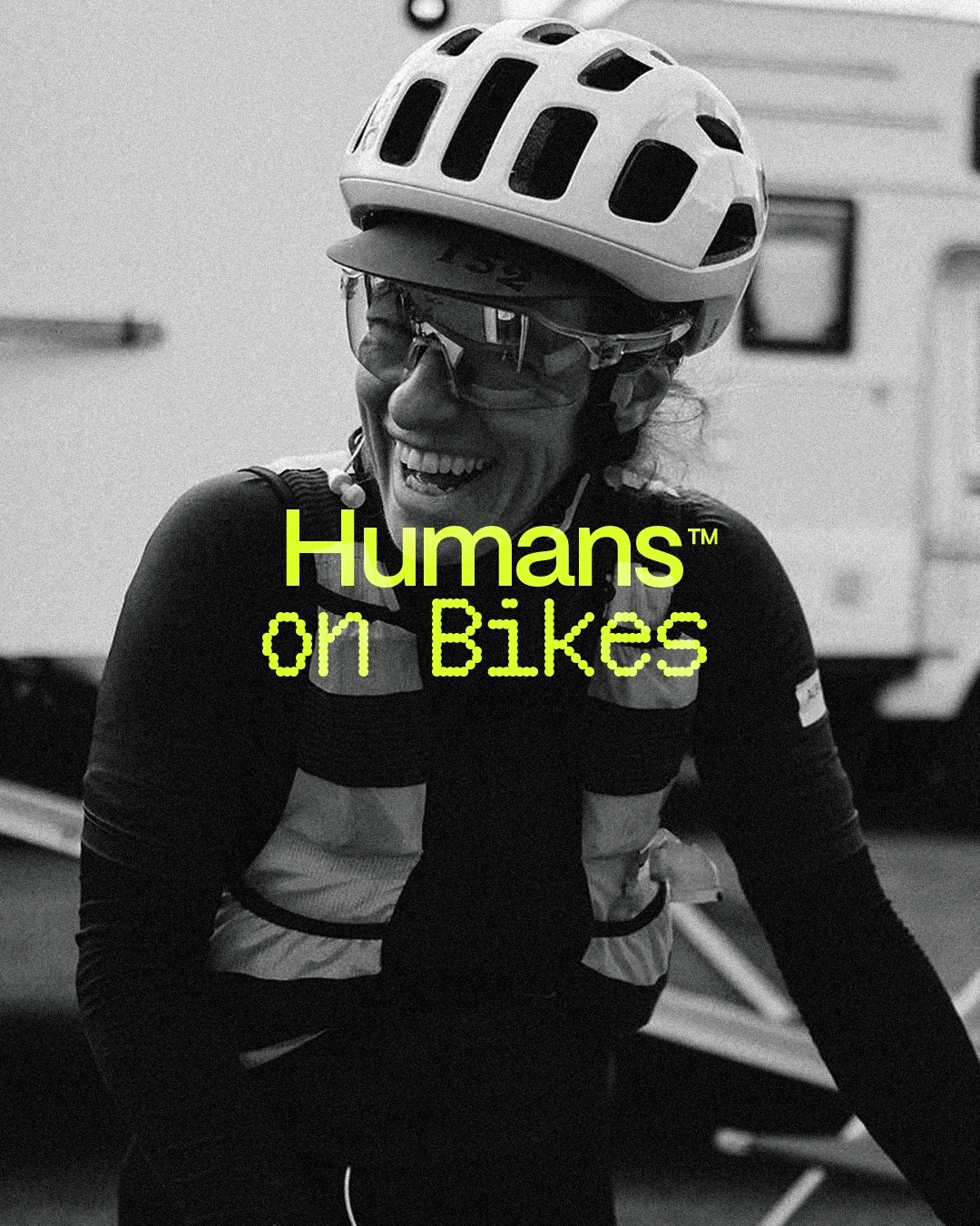
HUMANS ON BIKES
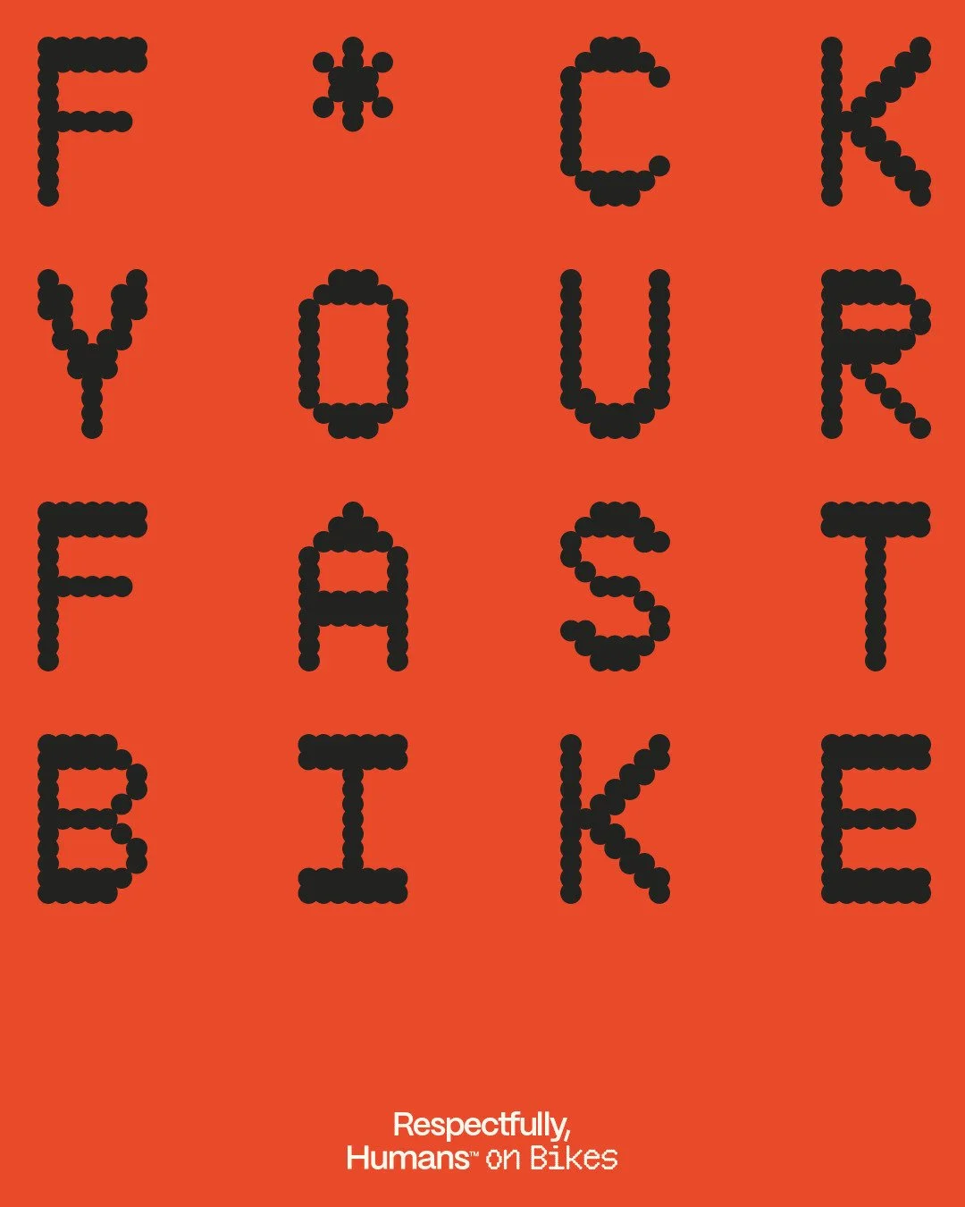
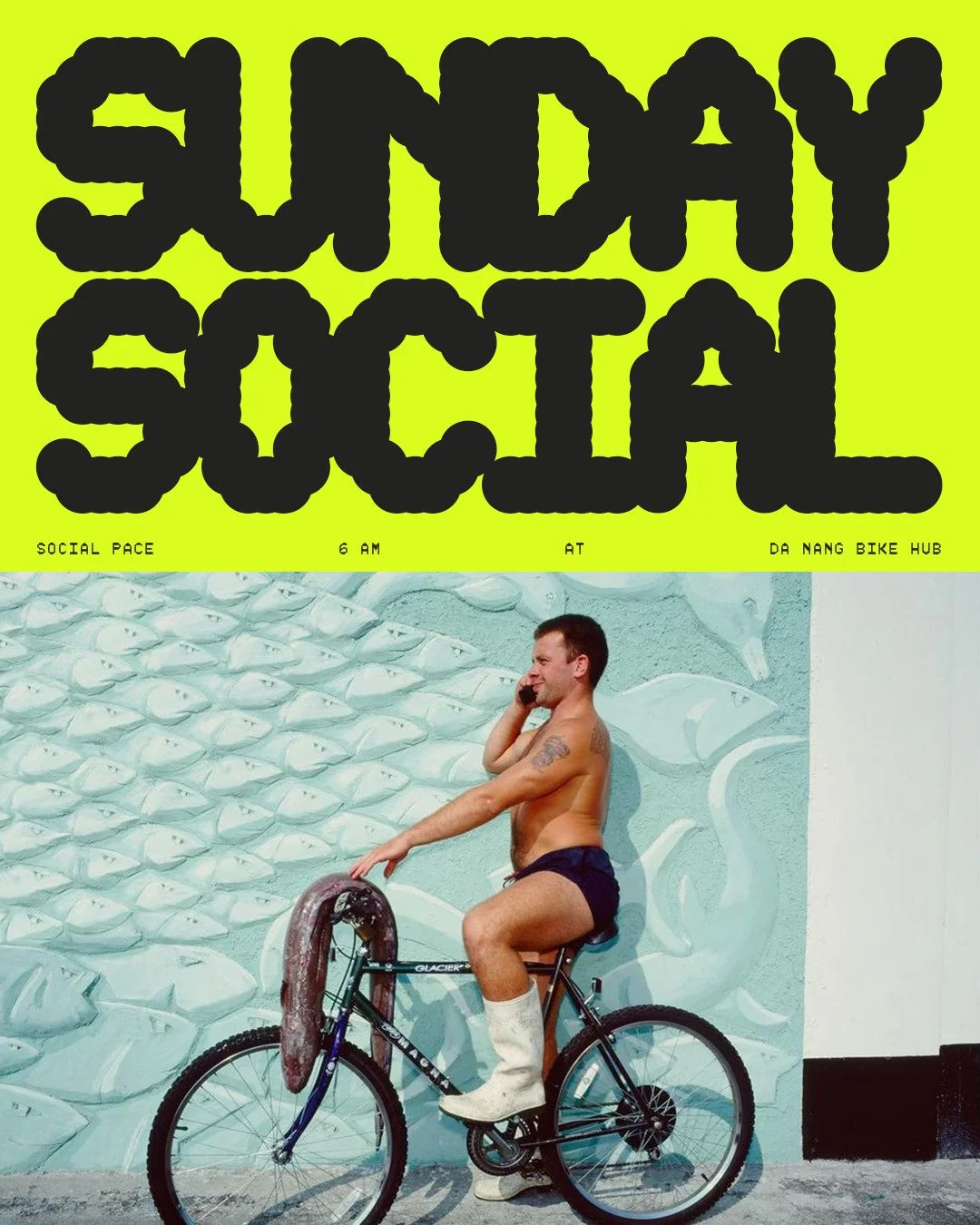
Cycling has a gatekeeping problem.
Too much jargon. Too much performance. Too little room for people who just want to ride their bike for the sake of it. The sport usually talks to the obsessed and quietly ignores everyone else. And most cycling brands follow that lead without ever questioning it.
Humans on Bikes started as a thought experiment. What if a cycling brand put the human first? Not the power stats. Not the gear. Just the ride, and the people on it.
Half a day. Total creative freedom. One question worth answering.
OBJECTIVE
The brief didn't start with what the brand wanted to say. It started with who it wanted to stop excluding. Credibility earned through honesty about what cycling actually is for most people, rather than performed through seriousness.
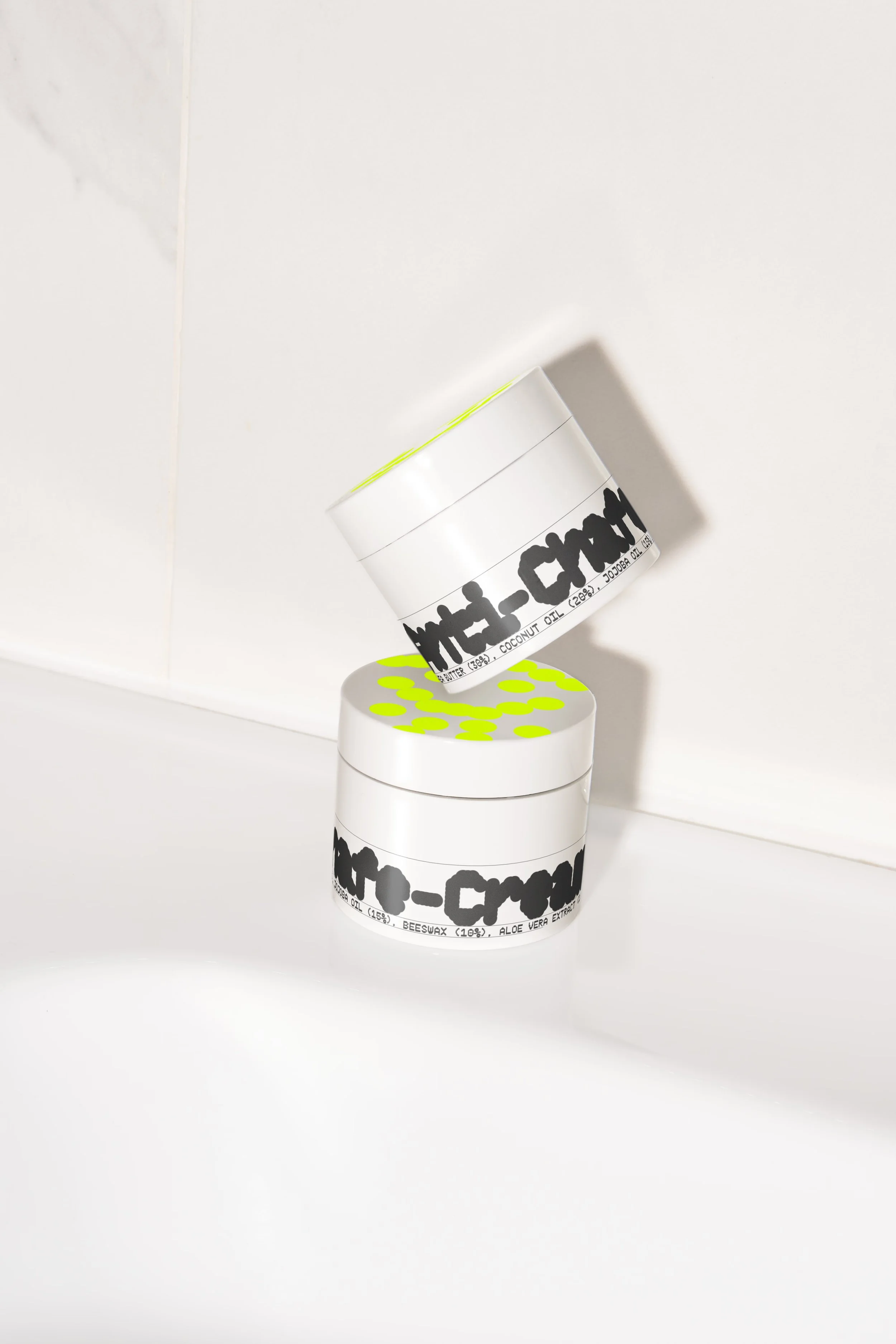
MADE
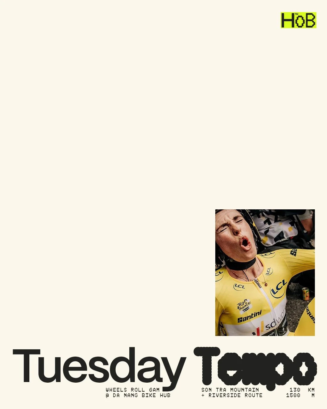
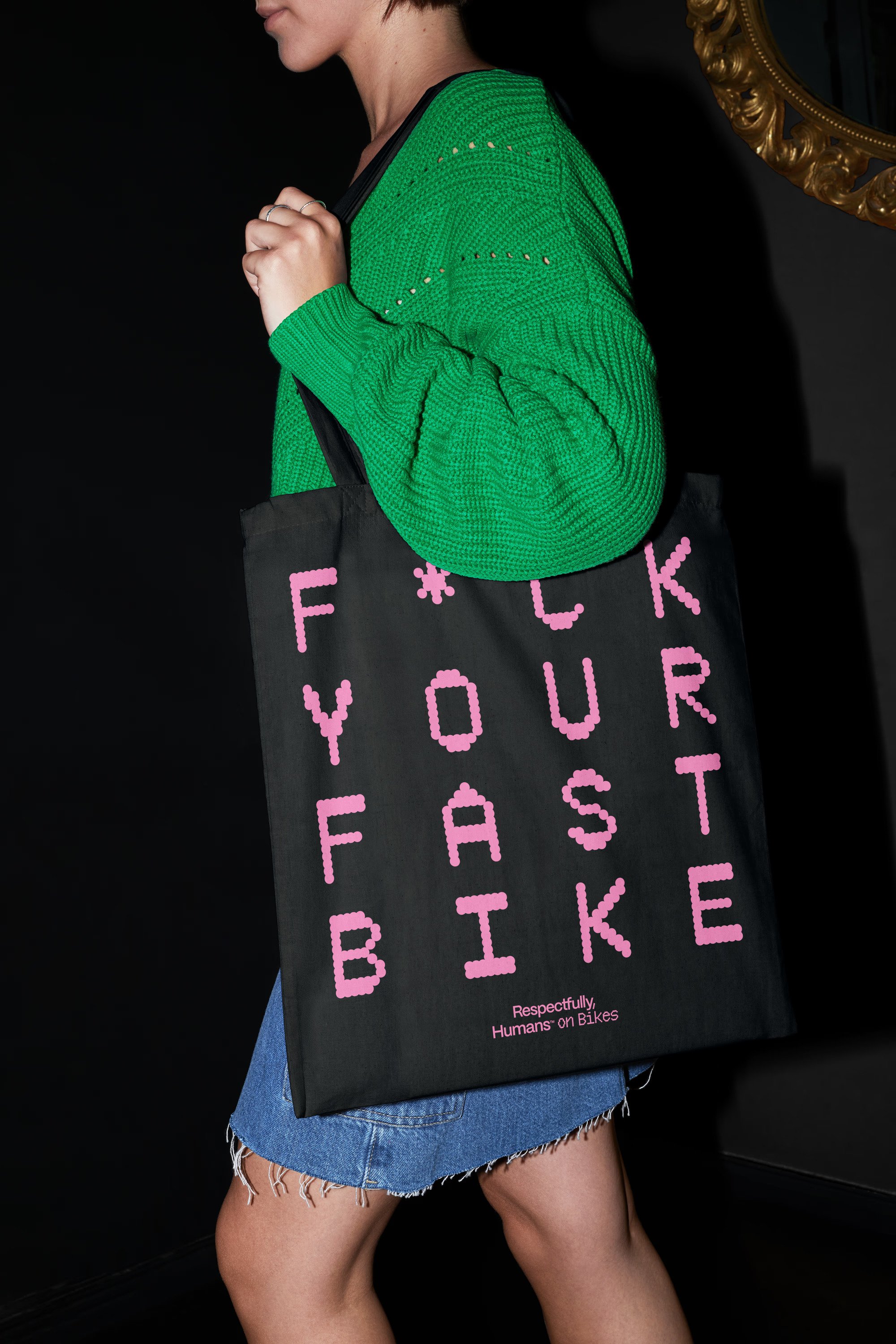
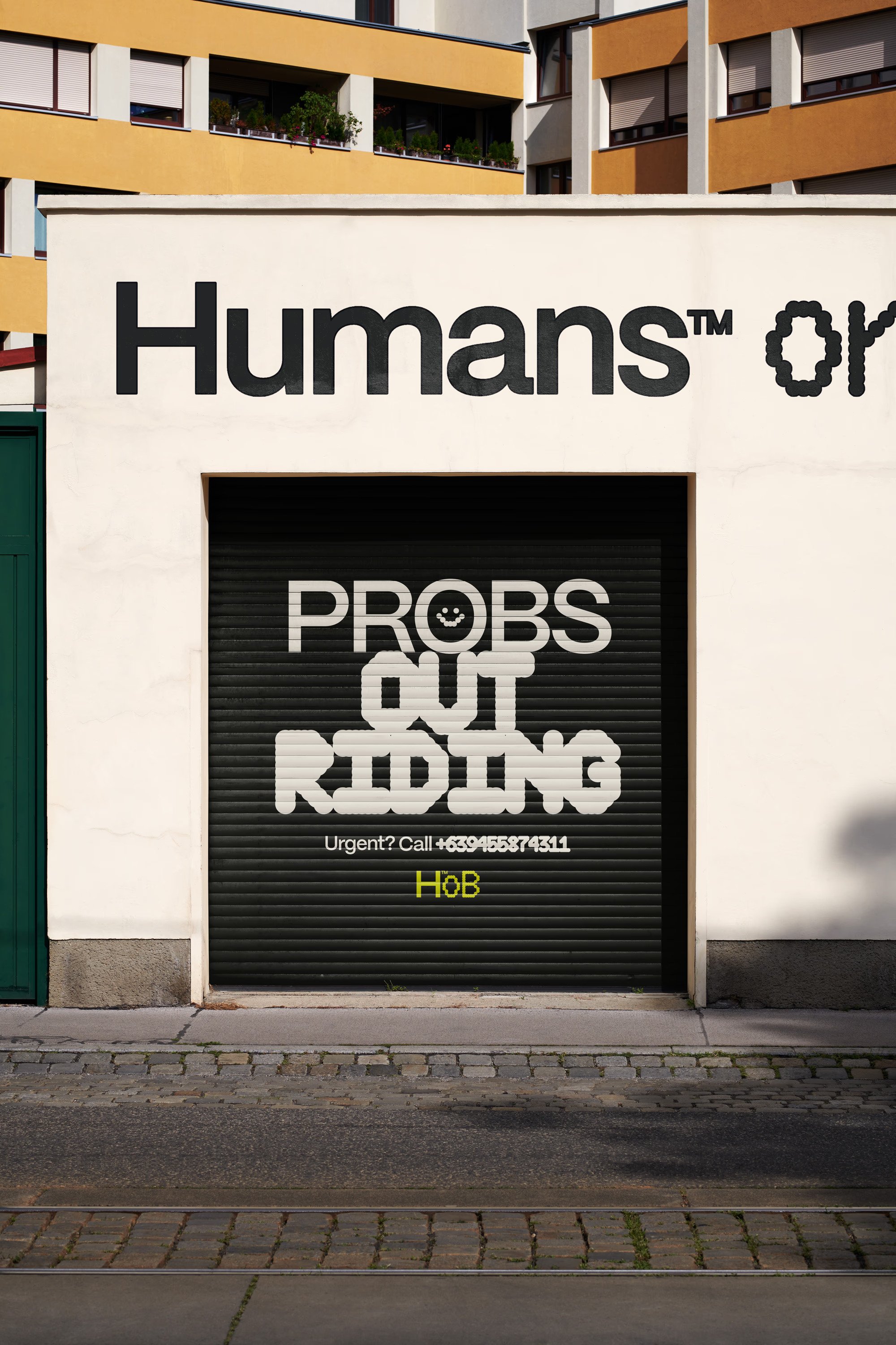
A complete brand identity from scratch. Tone of voice that trades spec-speak for plain language without losing precision. A visual voice centred on warmth. With a restrained palette, a modular template across posters, social and stories, typography that feels engineered but never cold. Every decision came back to the same question. Does this invite people in, or does it quietly tell them they don't belong?
DISTRIBUTION
This is a case study, not a client project. We created it to show what a Foundation Workshop produces when creative direction has total freedom. And to prove the point before someone asks us to.
OUTCOME
A brand that cyclists of all kinds can see themselves in. People-first. Straight-talking. Soul intact. Turns out you don't need a power meter to belong…
MODULES
/// Foundation Workshop
CREDITS
Kris Kala